
FM Consulting
KPI Command Layer
A weekly command center for engineering leadership — incident health, DORA delivery metrics, and product usage across teams in one view, with an AI-generated narrative summarizing what actually changed and why it matters.
Case study
The problem
Engineering leadership KPIs almost always live in three different places — an incident tool, a CI/CD system, and a product analytics platform — so answering "how did this week actually go" means opening three dashboards, none of which agree on what a "week" is, and none of which explain whether two things moving at once are actually related or just coincidence. Most teams either skip the synthesis entirely or spend a recurring meeting doing it by hand.
The solution
The command center rolls incident, delivery, and product-usage data up to a shared weekly cadence for three teams (Platform, Payments, Growth), so every number on every page is comparable apples-to-apples. Stat tiles show the latest week against the prior one with a clear up/down-is-good direction baked in, trend charts carry the history, and a severity breakdown and a signup funnel give the two domains that need a shape instead of a line their own view. A "Recompute metrics" action re-ingests and rebuilds every rollup on demand, and a "Generate weekly summary" action has Claude write a headline, a plain-language summary, and one honest highlight per domain — explicitly instructed to cite only numbers it was actually given, and to say "may be related" rather than assert a causal link between two things that moved the same week, since leaders lose trust in a narrative the moment it overclaims.
How it was built
Raw incidents, deployments, and usage snapshots are the source of truth, upserted by external ID and never overwritten by re-sync; weekly rollup tables are fully recomputable derived data, rebuilt from the raw tables by one shared rollup function rather than hand-maintained — the same shape a real nightly cron job would use, with "Recompute metrics" standing in for the scheduler. Three separate, narrow interfaces (an incident source, a delivery source, and a product-usage source) replace the single mock data generator that ships today, deliberately mirroring the platform-agnostic pattern used elsewhere in this portfolio: no single real system covers incidents, CI/CD, and product analytics at once, so no single interface should pretend to either. The AI narrative uses Claude's structured-output API against a schema requiring a sentiment and a cited insight per domain, with a deliberately-planted test case in the seed data (an incident spike in one team correlating with a deployment failure-rate spike in the same week, and an unrelated usage dip in a different team, in a different week) used to confirm the model actually distinguishes correlation from coincidence rather than pattern-matching on "numbers moved." The interface itself is a deliberately dark, high-contrast "mission control" treatment built against a validated colorblind-safe chart palette — sequential, categorical, and status colors are each assigned by the job they do rather than picked for looks, since a leadership dashboard that's misread is worse than one that's plain.
More projects

- Platform
Volunect
A role-based volunteer coordination platform for NGOs — multi-user team accounts, QR-code attendance check-in, and map-based event discovery, delivered end-to-end on Next.js and Supabase.
- Customer Experience
- Platform
Customer Portal Improvement Program
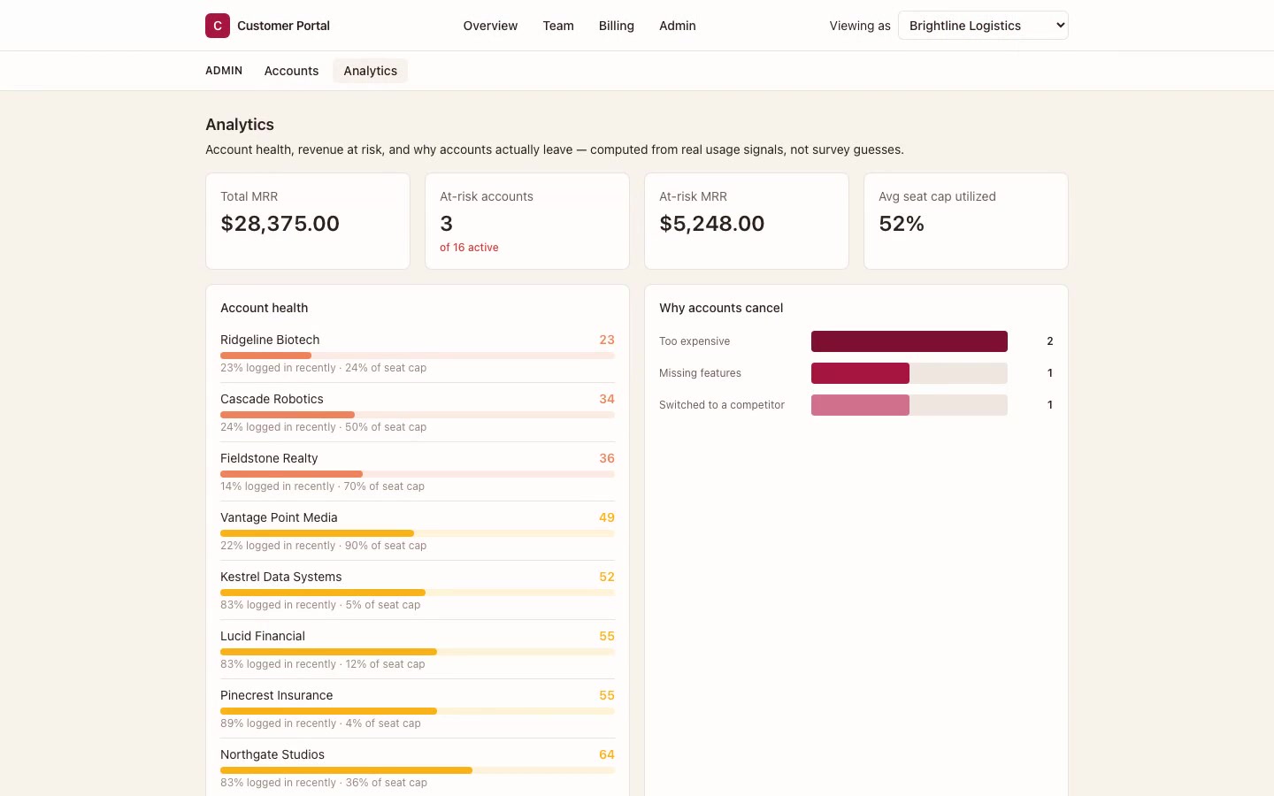
A self-service account portal for team, plan, and billing management — paired with an internal account-health view that scores churn risk from real usage data, not guesswork.
- Transformation
- Operations
Delivery Process Transformation
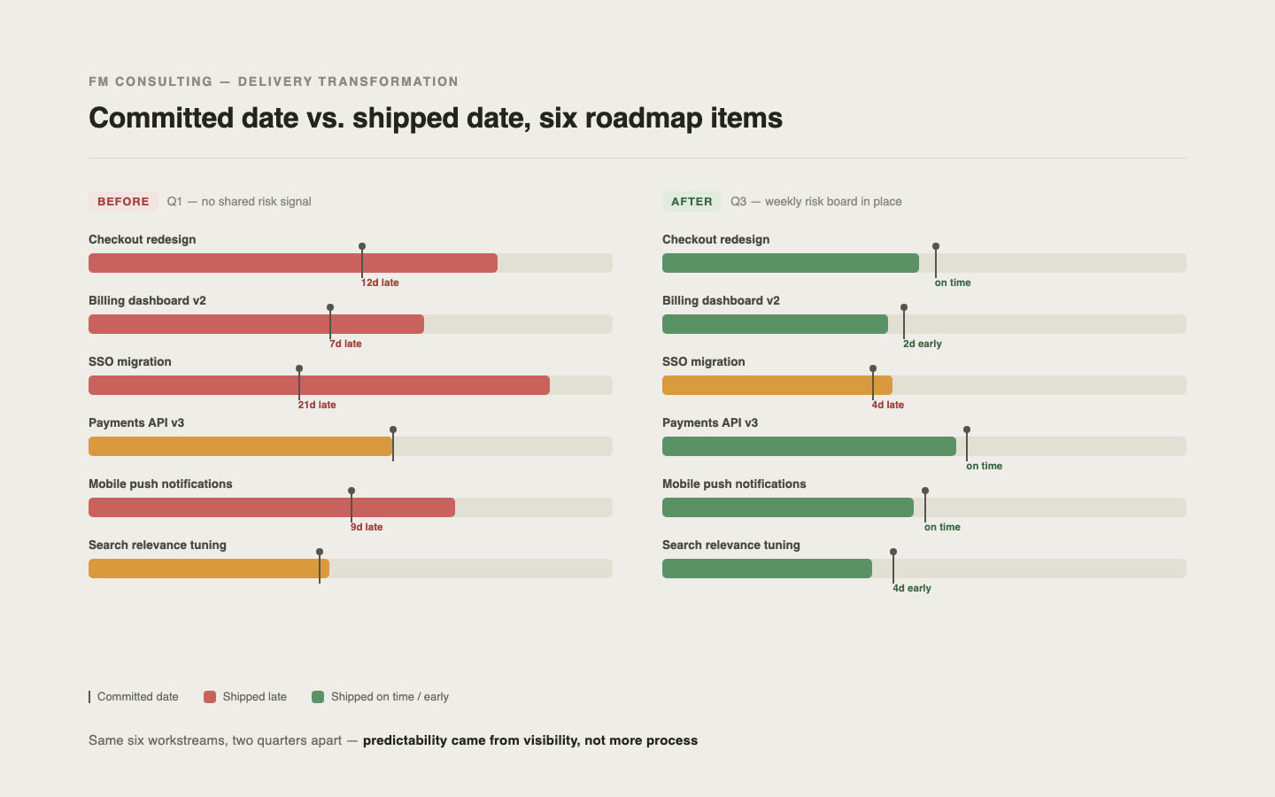
Brought structure and reliability to a multi-team delivery environment by improving ownership, planning, and stakeholder visibility.